Elvis Costello’s Landscape Lessons: 10 ideas from installation gardens

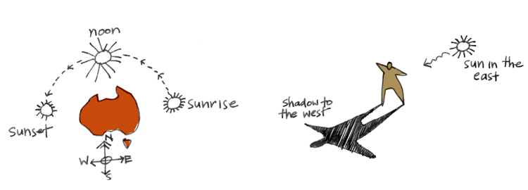
What exactly was Elvis Costello on about when he crooned "I don't want to go to Chelsea"?

I like to imagine an unfortunate childhood incident involving too much sunshine and an overdose of roses and sugary drinks courtesy of Great Aunt Fanny dragging the innocent lad around that fine bastion of Englishness, the Chelsea Flower Show.

I'm sure someone will set me straight.

Elvis notwithstanding, as the world’s gardening eyes turn this week to the opening of the 2013 Chelsea Flower Show, it seems a good time to chat about festival gardens. Can these temporary installation gardens provide clues to benefit our home landscapes, or are they a just a bit of a novelty, and waste of precious resources?

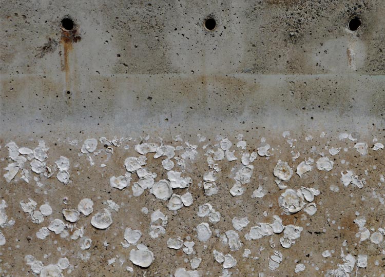
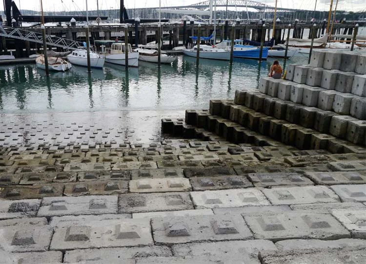
The worst garden festivals are truly throw-away. They last barely a few days, and a huge amount of time and effort is invested in making instant gardens that end up in landfill. The best garden festivals do things differently, often using materials and plants that can be recycled or reused, mulched or donated.  Most importantly, they invite us to think about our gardens and landscapes in different ways.

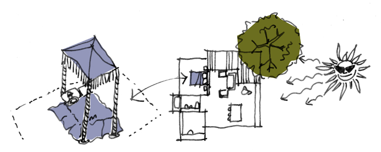
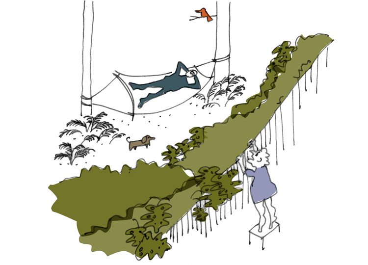
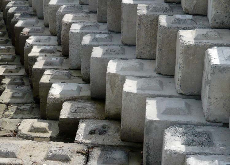
Here are 10 Ideas from Installation Gardens that can be used to help shape your own landscape. 

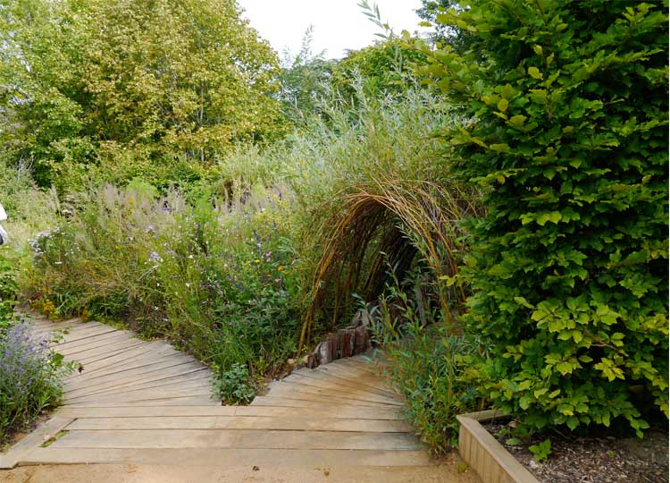
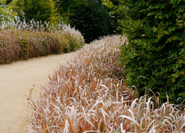
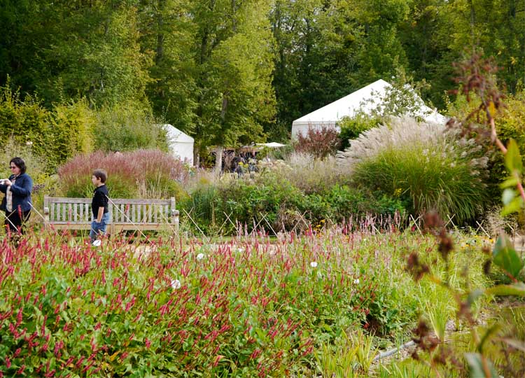
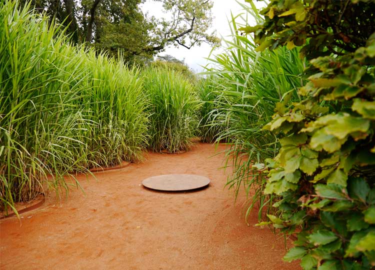
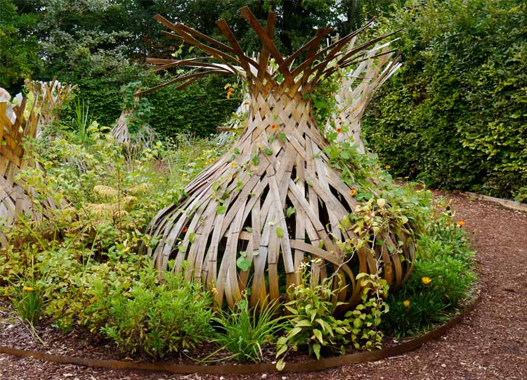
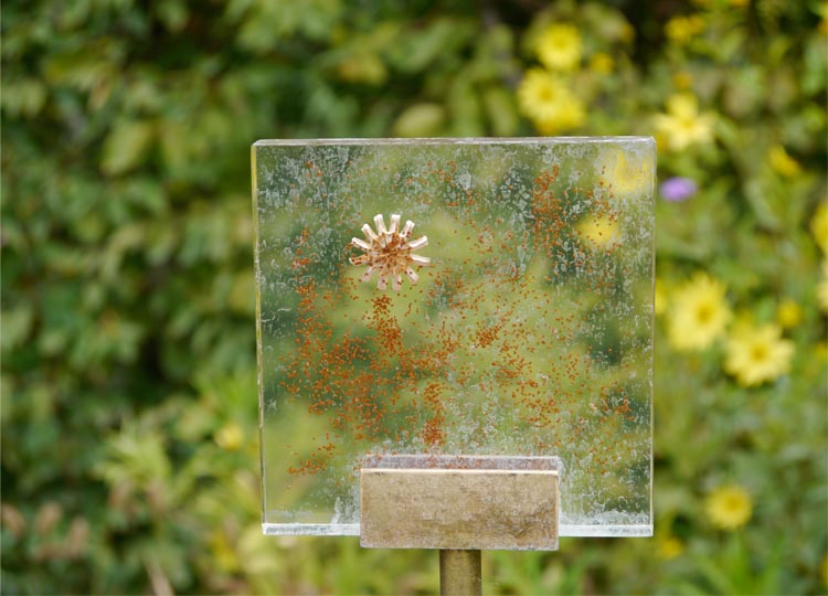
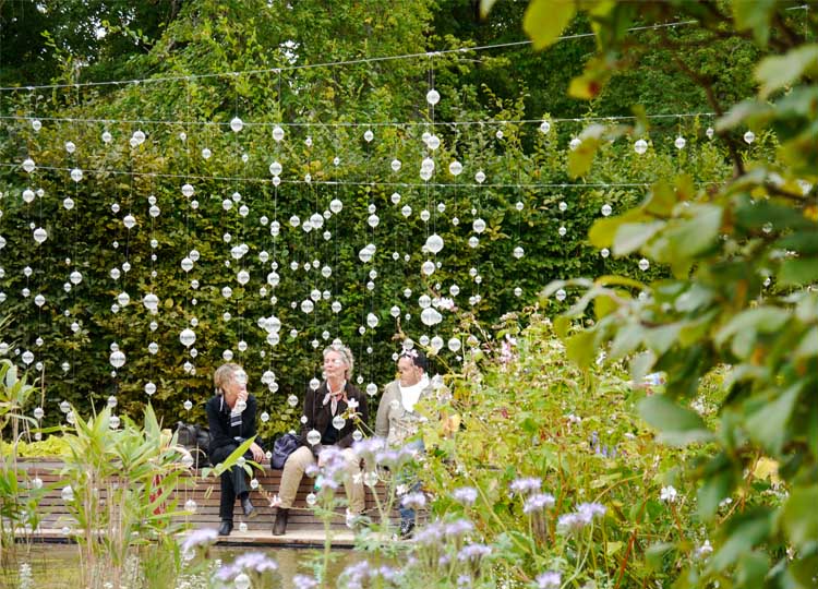
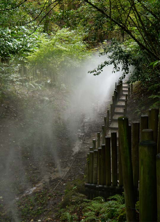
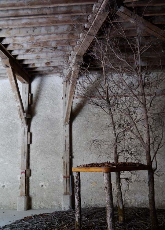
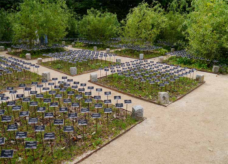
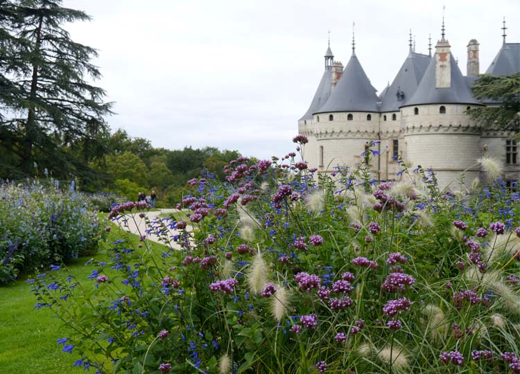
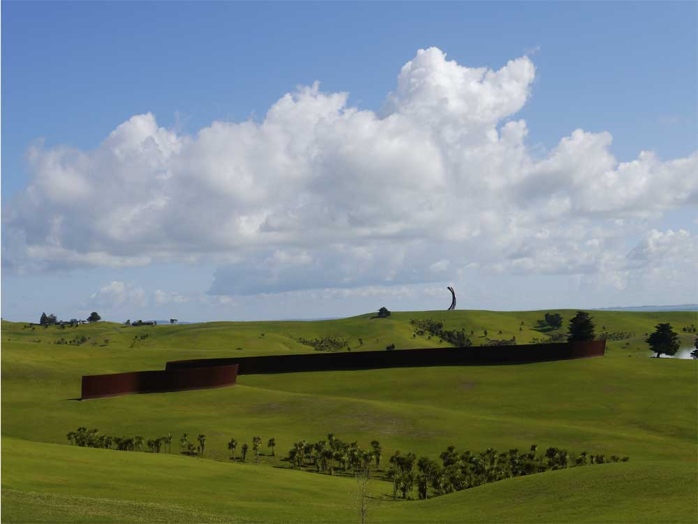
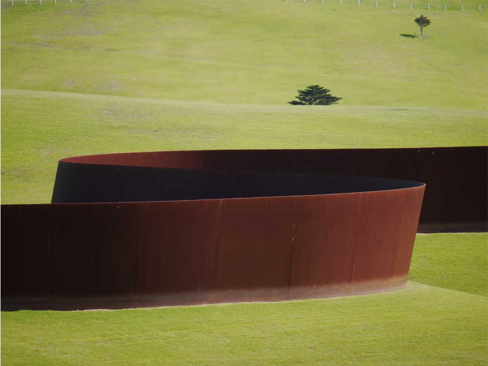
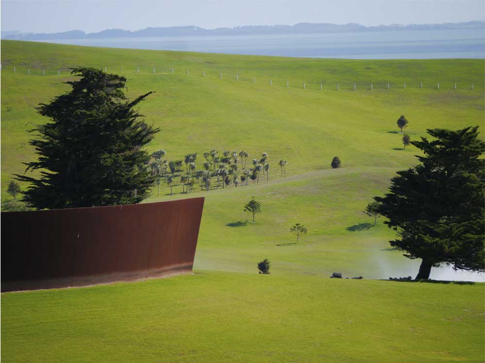
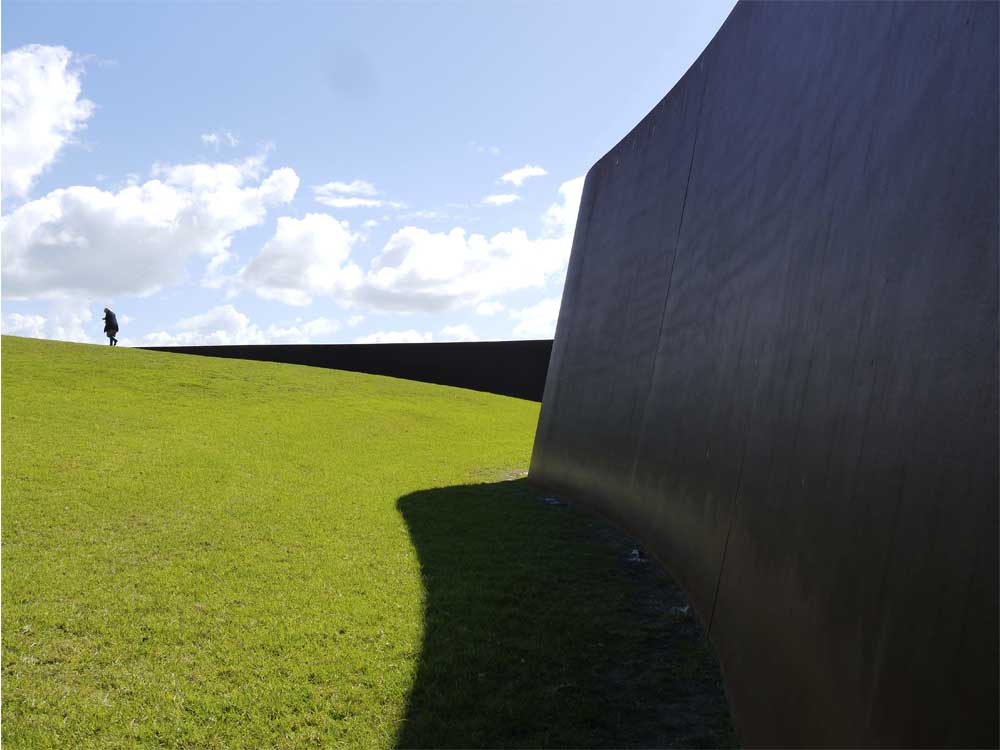
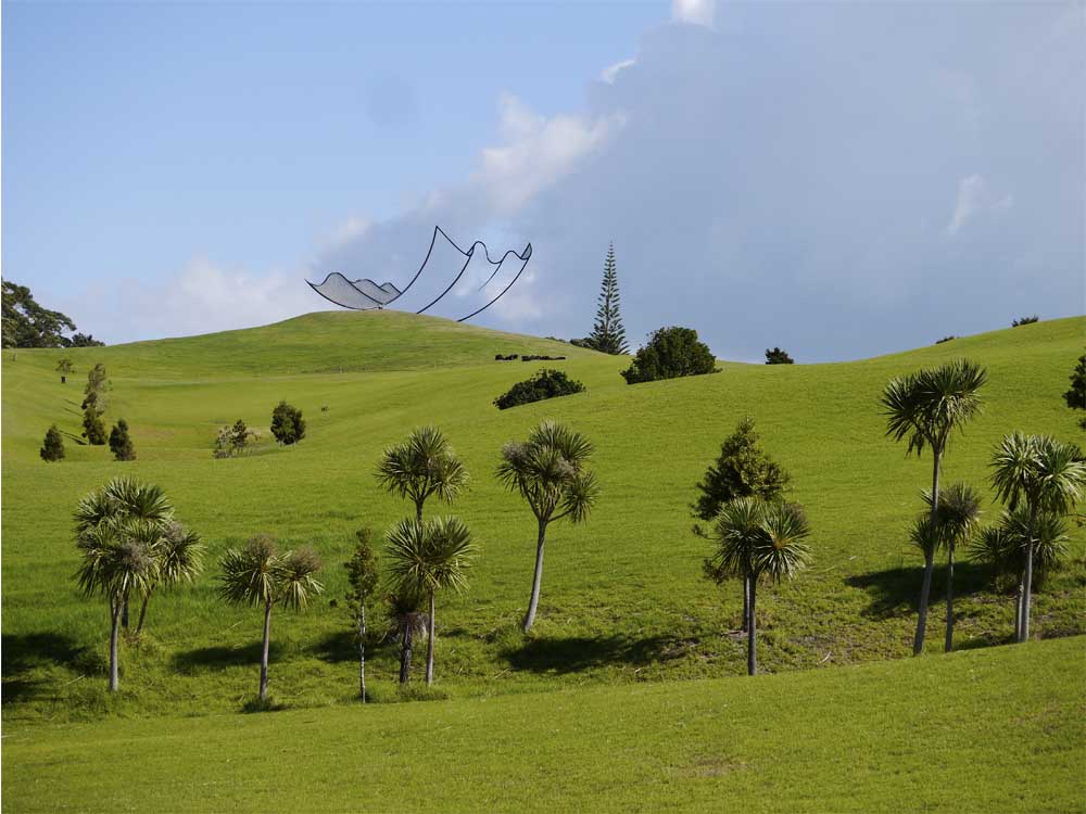
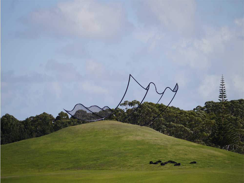
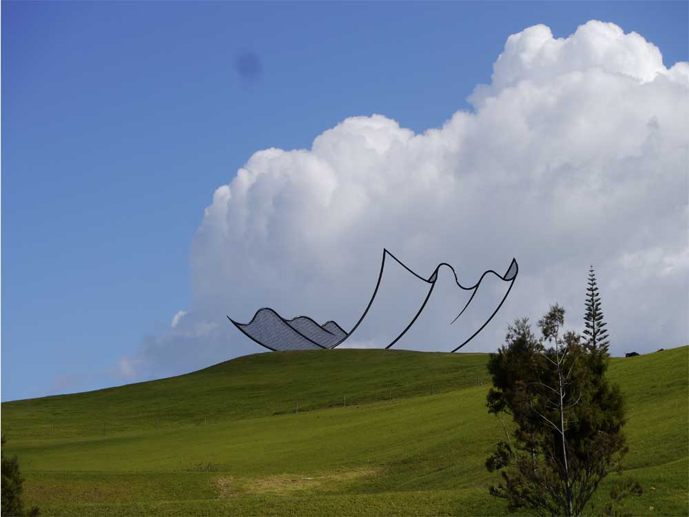
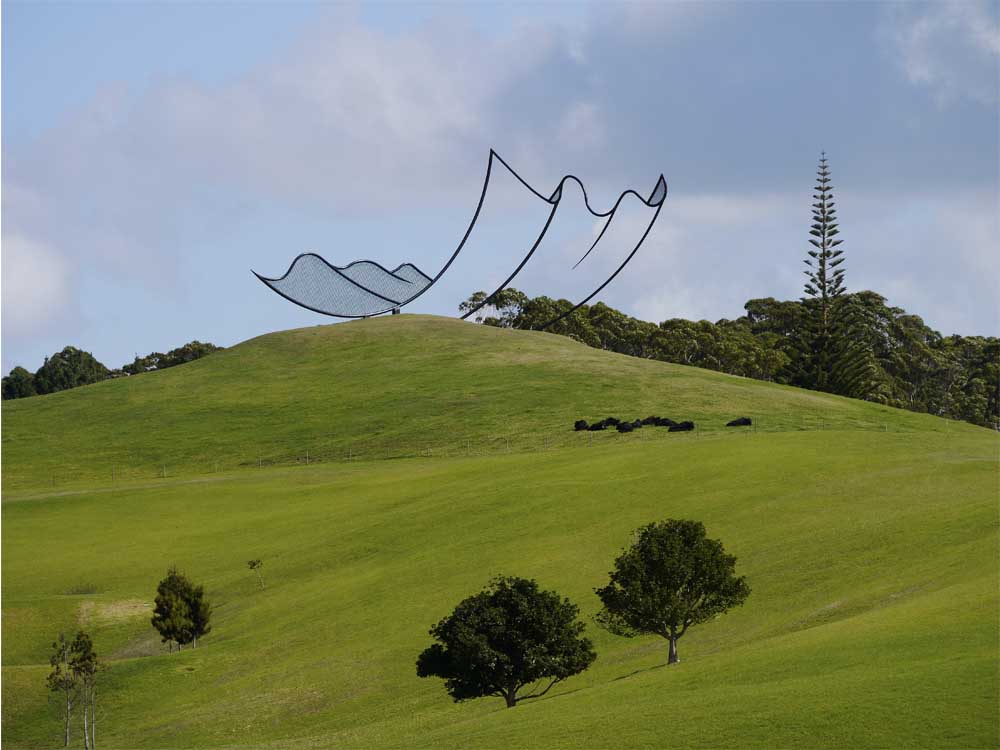
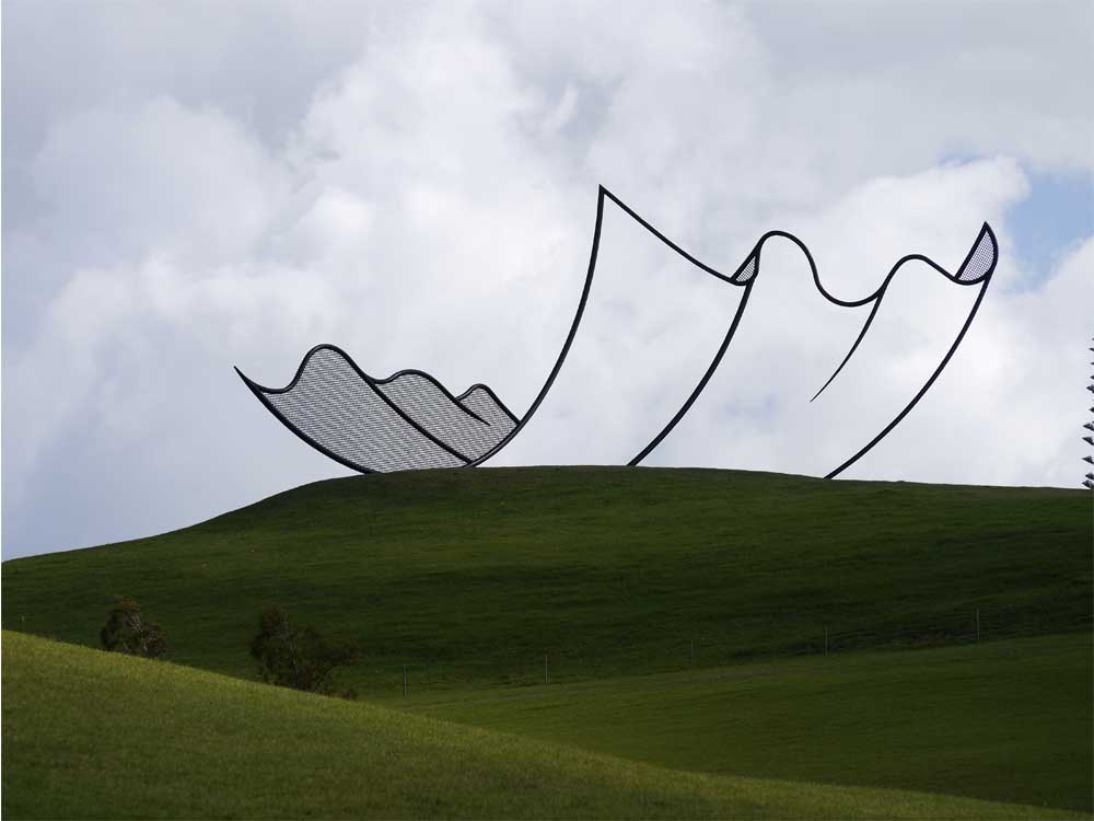
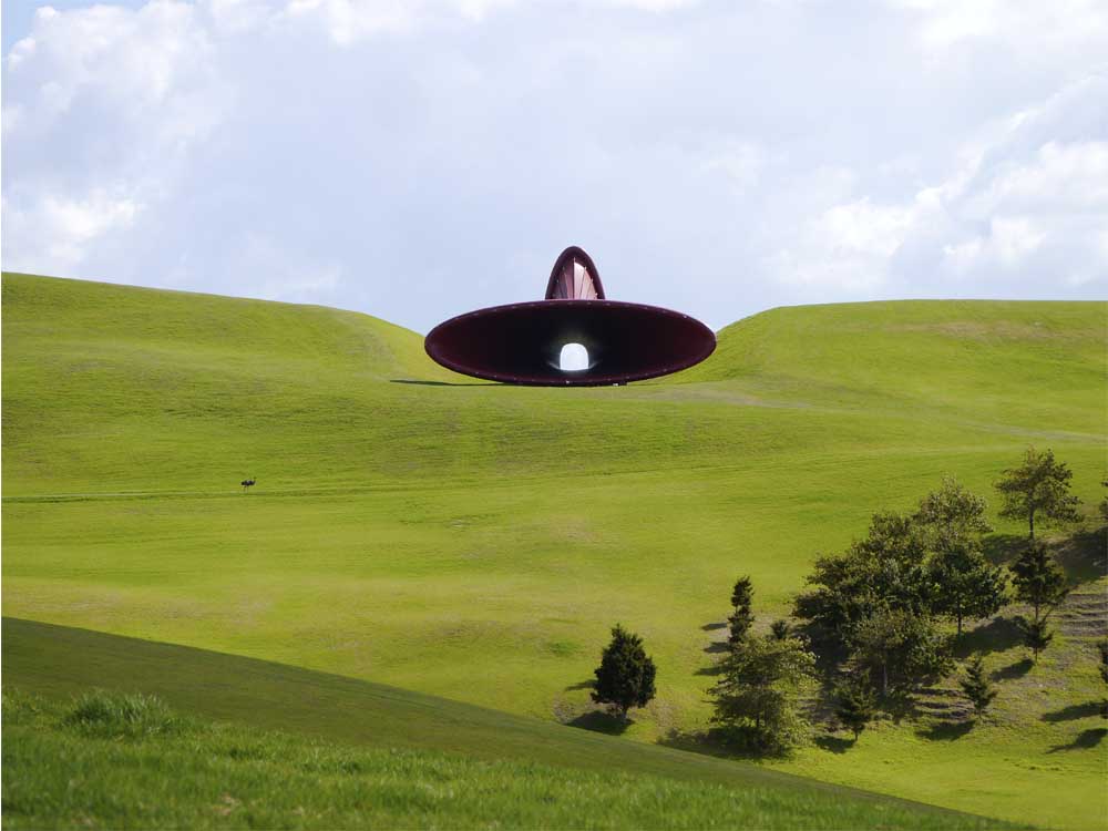
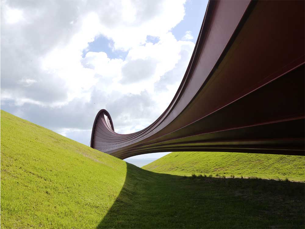
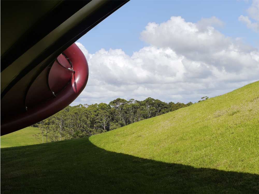
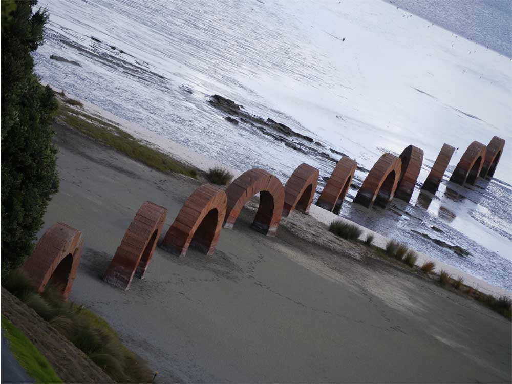
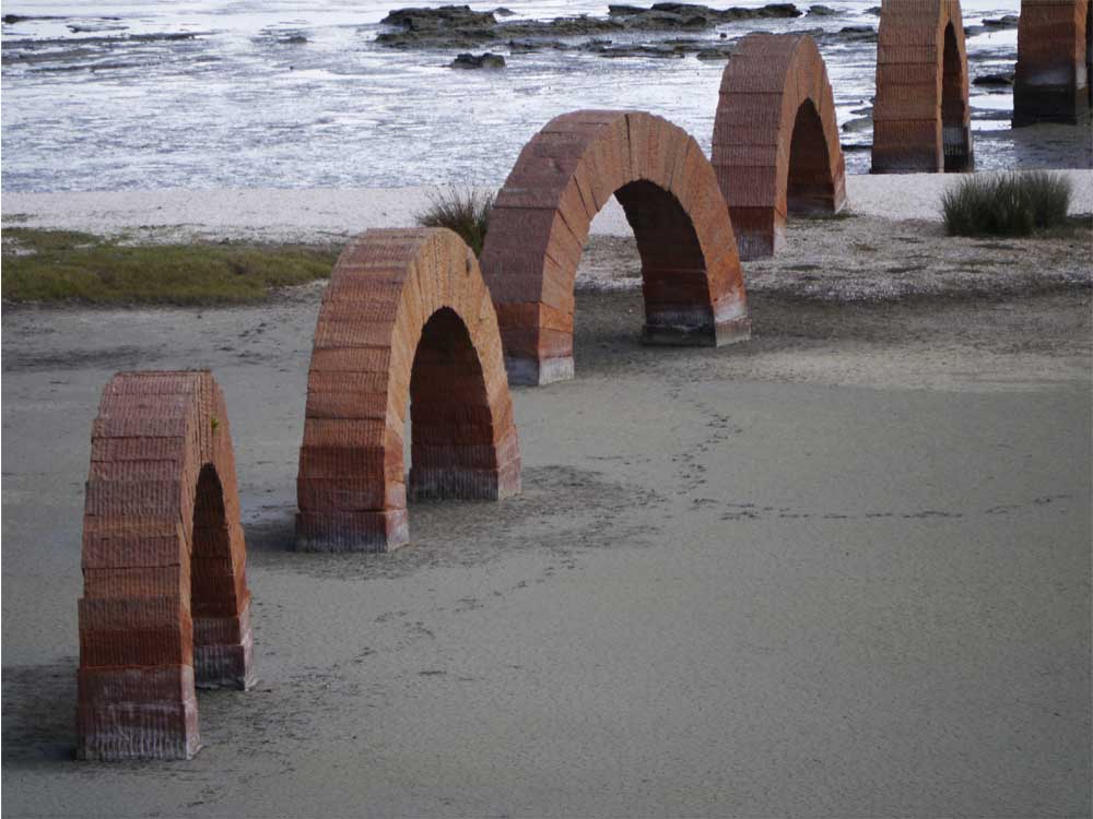
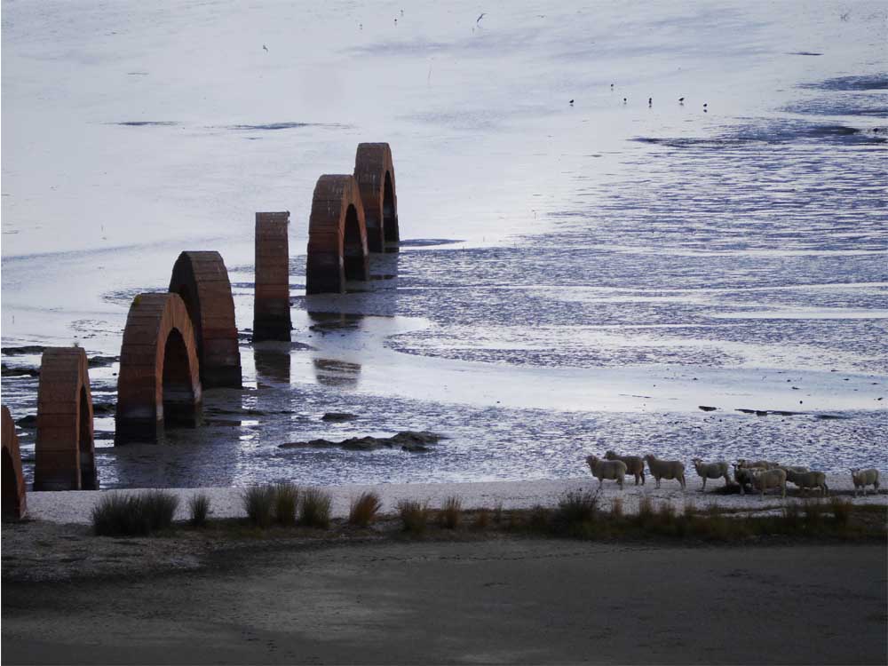
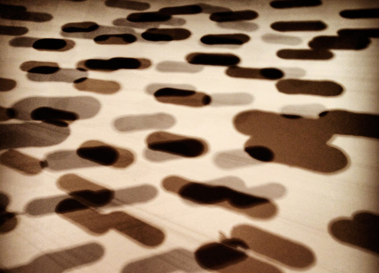
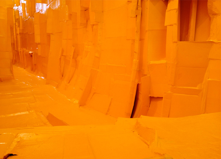
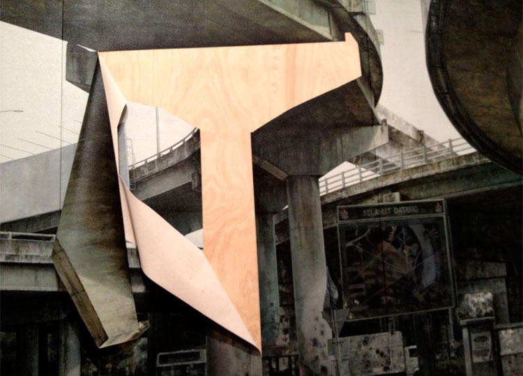
These images are all from the International Garden Festival, held every year in Chaumont-sur-Loire. Although the festival theme changes yearly, the over-arching aim of the festival is to inspire people to think differently about what a garden is, and can be. Garden festivals are but one of a range of temporary or installation parks that challenge us to re-think our landscapes. I find them so intriguing that I’ve devoted a whole chapter of my forthcoming book to discussing the world of Installation Parks.  But that's a whole other Elvis Costello song.

Now I want to hear from you.

Which of the 10 Ideas most appealed to you and why? Which can you see working in your garden landscape? Leave a comment below and let me know.

Know someone who might enjoy this article? Be sure to share it with your friends. See you soon for more landscape inspiration.

Big Prawn...Yawn: THIS sculpture park features the biggest from the world’s best

There’s nothing I love more than the opportunity to explore a new landscape. And if that landscape also happens to contain a couple of artworks, so much the better.

So it was with edge-of-the-seat anticipation that I joined 39 other curious people recently, on a bus headed to Gibbs Farm, about an hour north of Auckland.  The site visit was one of several on offer at the International Federation of Landscape Architects annual conference.

Although I was naturally fascinated to see the rural landscapes north of the city, (many with rich, diverse histories, and others under threat of encroachment by the growing city) it was the art that was calling my name.

But first some background.

Gibbs Farm is owned by Alan Gibbs, a well-known and uber-successful New Zealand businessman. He bought the original property over 20 years ago, and has added incrementally to his holdings. The farm lolls its way over rolling ridges, gullies and flats, in an ancient landscape surrounded by the stupendously spectacular Kaipara Harbour, the largest in the Southern hemisphere.

The scale of the landscape has, unintentionally, driven the art agenda: most of the works are the largest the artists have ever produced. From afar they look tiny, even insignificant. It’s not till you’re standing face-to-face with a 6 metre high rusted steel wall that the true scale actually registers.

So who are the artists who have created these vast wonderments?

Let’s start with that 6 metre high wall.

That would be Richard Serra’s Te Tuhirangi Contour (1999/2001). 

It’s made of 56 Corten steel plates, each 50mm thick and 6 metres high, and it runs for 252 metres.  That’s almost the length of 1-and-a-half jumbo jets. 

According to the visitor guide the “…steel plates lean out 11 degrees from the vertical and trace a single contour line across the land in a way that, in the artist’s words, “collects the volume of the land.”” 

This wall draws you in. The forty of us from the bus set off cross-country with hive mind determination. Like lemmings to the cliff we made for that wall. 

Once there, each panel continued to mesmerise, with miniature rusty landscapes of colour and pattern and texture extending out along the surface. 

Looking up for a moment, it was possible to see something on the distant horizon: a few bent paper clips perhaps? 

A reasonable hike instead revealed it to be Horizons, by Neil Dawson (1994).  Without something to give it scale, it looks like a wonderfully light calligraphic drawing, or maybe a piece of paper caught just at a moment of billowing in the breeze. 

Instead it’s a brilliant trompe l’oeil, etched in steel some 15 x 10 x 36 metres, and suggesting “…a giant piece of corrugated iron blown in from a collapsed water tank on some distant farm.” 

If Serra’s work collects the land, Dawson’s collects the sky. 

Over the course of the day clear blue skies, white clouds, and finally lowering greyness all settled in behind, colouring in the finely drawn linework of Horizons

We’re on a ridgeline now, and only the briefest of trudges brings us face-to-face with another gobsmacking sculpture. 

This one has “a fleshy quality which the artist describes as being “rather like a flayed skin”.” Ummm...choice, bro. 

Engagingly titled Dismemberment, Site 1 (2009), this work, by the fabulous Anish Kapoor, is compelling. 

Two vast elliptical steel rings are placed 85 metres apart, and a taut reddy-pinky membrane fabric stretches anatomically between. 

In the presence of such a strange and disquieting object it only seemed fitting that a lone, and apparently quite friendly emu came up to join us as we sat down to lunch. 

From this part of Gibbs Farm the Kaipara is close. The landscape plunges down to the beach, and the huge receding tides. We follow, until the Loch Ness monster stops us in our tracks. 

Looking closer, its arching loops are of no marine origin. Instead they are made of Scottish sandstone, each block 1.4m2. 

Together these 11 structures make up Arches (2005) by Andy Goldsworthy. 

I imagine they look utterly gorgeous in the sun, but in the late afternoon gloom they took on a mysterious quality which was only enhanced by the flock of sheep which suddenly ran along the foreshore to visit their local merino henge. 

Were these four works all that was on offer, one could go away a happy person.  Amazingly though, the hit parade continues, with gigantor works by Richard Thompson, Sol LeWitt, Daniel Buren, Maya Lin, Bernar Venet and more. It will be interesting to see how many more great works the site can support: given their vast scale they really do need breathing space around.

We were fortunate to be led on our tour by well-known New Zealand landscape architect Garth Falconer. He has been discussing, designing and debating the Gibbs Farm landscape for nearly as long as it’s been operating, and his generous, thoughtful and knowledgeable presence brought many insights to our day.

For those who are Garth-less, don’t despair. Gibbs Farm is open monthly by appointment. Find out more at their website. Take your walking shoes, get off the roads and paths, and enjoy a wonderfully stimulating day engaging with eye-popping artworks in an amazing setting.

Now it's your turn. If you were Alan, who would you invite to create the next uber-artwork for Gibbs Farm? Let me know who and why. And if you enjoyed this article, be sure and share it with your friends so they can have a say too!

Design: the second-nicest thing you can do with another person

What a pleasure it was for me to collaborate on a project with the almost indecently talented Nicole Phillips. As well as being super-brilliant at just about everything to do with typographic and publication design, Nicole is also a tirelessly supportive friend…what Brene Brown would call a “move-a-body” friend!

We met years ago in our past lives working for an international design firm.  Since then Nicole has been my go-to person for all sorts of visual communications. I’ve been especially lucky that she agreed to do the graphic, visual and cover design for Future Park, my forthcoming book.

In between my book deadlines, and running her own thriving business, Nicole jumped at the opportunity to collaborate on a public art project for a new community centre at the Gold Coast. We were fortunate enough to be shortlisted to one of three teams to develop and present a concept design to the local council and others involved in the project.

After analysing the site and it surrounding context we knew we wanted to explore ideas of folding, creasing and weaving. This was inspired by the geology of the area, the rows of pointed roofs on nearby houses, the creek bed at the end of the street, and even old-style folded entry tickets referencing the theme parks up the road.

We also had to locate the artwork on a north-facing wall, so we were keen to create something that would cast dynamic shadows over the course of the day.

Here are some of the pages from our presentation, showing a snapshot of our experimentation.

Although the panel awarded the next stage of the project to Belinda Smith (another of my talented pals), Nicole and I had a great time bringing together our respective skills to collaborate creatively.

This project has also given me lots of ideas for future work…if you’ve seen any of my Instagram pics you’ll already know I’m a huge shadow nut!

If you haven’t, why not head over now and check them out. Otherwise let me know what you think about the experiments. I’d love to hear which ones appeal to you and why.

And embrace collaboration, it really is one of the nicest things you can do with another consenting adult.

Design Class: learning to love your orientation

Have you ever heard designers speak about orientation? Has it given you pause for concern, worried that your penchant for wearing latex and scuba suits in manners for which they were not originally intended is about to be revealed? 

Fear not.

The orientation we’re discussing here, if properly understood, will actually make it easier and more comfortable to enjoy the things you want to do in the privacy of your own home and garden.

So what is orientation?

Orientation simply means the location of your garden and home in relation to the sun.

In Australia the sun rises in the east, travels through the sky to reach the north at noon, before descending again to a western sunset. In summer the sun is high, and in winter it is lower. 

Why is this important?

If you live in northern Queensland and you want to have Christmas lunch outside on your new deck, then you don't need me to tell you that you need to understand where the sun’s going to be at come midday. Once you know, you can make sure the deck is placed where it can be shaded by trees, roofing or a combo of the two.

On the other hand, if you live in high country Tasmania, you'll probably want to plan your deck and garden so you’ll be warm and sheltered. Seems pretty obvious when you think about it, but you'd be surprised how many houses have been built that don't take account of this simple, yet significant factor.

This approach translates through every aspect and detail of designing your home, garden and landscape.

Do you have bizarre night time rituals that require long, uninterrupted sleep-ins? Maybe don’t put your bedroom on the east side of the house. 

Like to swim in a cool oasis, out of the sun? Maybe put your pool to the south, or make sure there’s space for a dense surrounding garden with shade trees. 

Want to grow a kitchen garden? Make sure adjacent buildings or trees aren’t over-shadowing the space. 

And finally, if you do wish to loll on the lawn in your scuba suit, then maybe some strategically placed sun shading will protect your privates from poaching, and your neighbours from nosying. 

Now it’s over to you. How did you enjoy the first lesson in Design 101? What would you like to learn about next? Let me know what weird words you've heard designers use that you'd like clarified. And finally, let me know how understanding your orientation is going to free you up to think more creatively about how you plan things in your home and garden, scuba suit or not.

Walls That Tell a Story


Can you guess where this wall might be?

How about this one?

Even in close-up, these walls are starting to tell stories.

Stories about their location, about their history and about the conditions they experience every day.

It’s a bit of a no-brainer really, once you start looking properly, to tell that these walls are near the waterfront. Both can be found in the ever-increasing necklace of public places fronting Auckland’s famous harbour.

Let’s start with those oyster walls. They’re part of a massive temporary, playspace in Wynyard Quarter. The whole design by Isthmus imagines a waterfront that might lie beneath the existing ground, and the walls help tell that story.

On fine sunny days big kids and small were all over it like you wouldn’t believe. From a distance the shells in the walls can’t be seen, but then the scale, mass and colour of the concrete takes over the job of telling the story.

The other wall is part of a revetment wall near the end of Silo Park that tumbles down to the water. It’s the daily tides that have painted it in such beautiful graduating hues.

The wall acts as a mini amphitheatre, with everyone walking past able to look down and see you. Despite this the change of level creates a surprisingly private and secluded nook (a nookie nook for this pair...) away from the main promenade and activities.

These blocks that make up this wall have been recycled by Taylor Cullity Leathlean | Wraight + Associates from old precast concrete units that were once used for storage.

I love the stories embedded in landscapes, and the connection they create between the past, present and future.

We are working on a project at the moment that will make walls using existing paving that we're removing to create better level transitions. Doing this creates a win-win: we solve the challenging Once built, these walls will then become another chapter in the story of this landscape.

Examples like this are everywhere if we take the time to look. Where have you encountered walls that tell a story? How could you adopt this approach to tell a story in your landscape? Let me know in the comments below.

And if you enjoyed this taste of Auckland’s waterfront landscape then stay tuned, as I’ll be sharing more in the next few weeks.

Rust and Shadows - landscape wonders of the Asia Pacific Triennial

A whole exhibition dedicated to the way artists from different cultures and places see their landscape – few things could be more enticing for your Landscapologist. So it is with great excitement I bring you my completely biased personal faves from APT7.

APT is officially The 7th Asia Pacific Triennial of Contemporary Art, and it’s on until April 14 at the Queensland Art Gallery.  Sure, sure, it’s not described in any catalogue as a ‘landscape’ exhibition. But that doesn’t change the fact that nearly every single one of the pieces on show in this epic cultural event represents a deeply physical, emotional and sensory connection to place and landscape.

Let’s start with Shirley Macnamara’s gorgeous Wingreeguu 2012. At first glance it looks like a chance breeze has blown it, ready formed, into place in the gallery, and yet it tells so wonderfully of a very particular place - spinifex land of far western Queensland - and its role in the lives of both Shirley’s traditional people and the later grazing community. It’s as if the artist has reached back through time and plucked out the heartstrings of a thousand generations, and then woven in the tough grass to encircle the work.

You can see the same re-imagining in Lorraine Connelly-Northey’s stunning pieces.  Crafted from salvaged farm and building materials, they reinterpret the traditional fibre practices of her mother’s Waradgerie people. Couldn’t you look at the patina of rust for hours? No matter what distance you’re at the surface resembles it’s own richly detailed landscape of tiny textures and colours.

Landscapology_APT7_Northey.jpg

I’m not sure if it was the way they were hung, or the overcast sky when I visited, but these works would have been doubly delicious for me had they been lit to throw shadows.  As a long-time shadowphile I was heartened to discover that several other APT offerings definitely gave good shadow.

These elegant beauties were cast by Sopolemalama Filipe Tohi’s Kulasi; crisp geometries and such rich, strong colours humming as the taut cylinders floated against a dark background.

Richard Maloy’s Yellow or Blue?  both consumes space and creates it anew. The enormous cardboard installation suggests a landscape of rugged, impermeable terrain that all the same could collapse at any moment. Is it perhaps reminding us of the dangers of hubris? That humanity’s great edifices remain standing by chance rather than design? And what's with the yellow? Is Mr Maloy tipping his hat to The Vault, Melbourne's much maligned 'Yellow Peril', or am I reading too much into things?

Around the corner, Parastou Forouhar’s Written room uses clouds and dust storms of Arabic script to create a swirling, pulsating landscape that writhes off the walls to embrace the viewer.

The urban landscape is not forgotten either.

Both Nguyen Manh Hung’s Living together in paradise and Paramodel’s How to make a paramodel use accessible, almost whimsical techniques to comment on today’s cities and pose questions about the future of the metropolis in Asia Pacific countries.

Phuan Thai Meng’s jaw-dropping realistic painting in The Luring of [ ] draws us into the in-between spaces of the urban landscape.

Finally, Yuan Goang-Ming’s Disappearing Landscape – Passing II  is a wondrous video installation across three screens that evokes the urban landscape of Taiwan with great delicacy, compassion and genuine curiosity. I loved it.

If this was all the APT7 had to offer it would have been enough. Luckily for us, there’s way more on offer. If you’ve been along, tell me which artist most moved you, or most clearly evoked a different landscape? If not, when have you experienced an artwork that powerfully spoke of a place or landscape?

Art shares with landscape the power to move, inspire, comfort, awe and amaze us. I hope they continue to do so for you.

See the APT while it lasts or check out the QAG website for more details on the artists and the show.

In , Tags ,